Monday, 21 November 2011
Friday, 18 November 2011
Price
Price
The price I feel that would be appropriate for my magazine would be £3.75 because it would cost a lot of money to make the magazine and use good quality paper. Normally music magazines would cost a lot of money to publish because there are a lot of pages that would be included in the magazine. Also the music magazine would be published once a month so that would make the magazine filled with a lot more information and the printing money for the ink and the coloured pictures would cost o lot of money. The publishing company I would want to use would be IPC Media because they are the company that publishes NME music magazine and because my magazine is inspired by NME I feel that it would be an appropriate publishing company to use.
Wednesday, 16 November 2011
Target Audience
The target audience for my magazine would be around a similar age as NME magazine and Q magazine. The suitable demographics age and gender I think would 16-29 for both male and female, but I think that the magazine would appeal more too male than female. With my market research I have done, I would say that the S.E.G groups for my magazine the C2 and D. The reason for this is because I think that the readers would be in the social and the esteem categories in the Maslow ‘Hierarchy of needs.’
Tuesday, 15 November 2011
Q Magazine Liiar Analysis Front cover, Double page spread, content

Language: The masthead that is used in this music magazine is that it is very short and very memorable, so if someone saw it on the self they would remember the fact that it is a good music magazine. Also the house colour that is used is red and white, there are usually three colours that would be used, but the fact that there are different coloured clothing adds to the affect that there is more than one colour. The main imagine on the front of the music magazine is the picture of Alex Turner and the rest of his band mates in the back ground. There is a headline at the bottom of the page ‘ARCTIC MONKEYS’ this is a lot more eye catching than the actual name of the magazine because it is dominating the page. Underneath the headline is strapline which tells you a little bit about what might be in the magazine article, you could also call this a caption. Around Alex Turner is a teasing content which give a little brief on what else might be inside the magazine. On the left hand side there is a short statement ‘They’d stab me to get to the top, THE STROKES. Their most Explosive interview ever’ this is making the reader wanting to use it stating that it is the ‘MOST EXPLOSIVE’ interview ever. This can be seen as a lead because it is in bold and in larger typeface than any other information around the edge of the issue.
Institution: Emap media are the company that published Q magazine, they produce a wide range of magazine, but emap are the only music magazine they publish. They have a wide range of magazines stretching to 85 and they have over 25 million readers in the UK.
Ideology: The fact that Alex Turner is the most dominant person in the picture tells the reader that he is the main band member and the most well known
Audience: The target audience for the magazine is around the age of 17-35 because in Q magazine it also has articles on films and other media, so this can widen the audience. The magazine has a range of different music that is featured in the magazine this could also widen the audience. The magazine is out every month so this means that it is going to be more expensive, so older people are going to be able to afford it instead of younger people who are living the student life. When they younger generation can afford to spend their money on a magazine then they would purchase Q Music Magazine. The S.E.G of this magazine I feel would be: E- Casual labourers, unemployed and also D – Semi-skilled Manual workers. I think this because when people can afford a higher lifestyle then they are not going to be interested in music magazines. In Maslow’s ‘Hierarchy Of Needs’ I feel that the readers would be categorised in ‘social’ which means the need to belong to be part of a group and also in ‘esteem’ which means self-esteem, status, respect and admiration of others.
Representation: The connotation of the magazine would be students because it is an appropriate age group to put the magazine in to. With this magazine there is not a stereotype that you could join with this like Kerrang, because there are a lot of different types of music. It would be for the youth because of the layout and the use of the different typeface and it is not a simple layout

Language: On the right hand side of the double page spread, there is an image of all members of the band but as I said before Alex Tuner is stood closer to the camera because he is more well-known than any of the other band member. The way that the band members are dressed could draw the reader’s attention because if they like the Arctic Monkeys then they are going to want to dress like them. On the right hand side of the page, there is a denotation which is the simplest but most obvious level of meaning. ‘IT’S RIFFS. LOUD FUNNY’ this quote does not really make sense but is teasing contents which makes the reader wants to read the article to try and make sense of what it meant. The denotation is bold and it fills up three quarters of the page with only three words and draws the attention to the reader and draws the attention to the reader, the lead underneath the denotation has Arctic Monkeys highlighted to draw the make sure the readers read the article.
Institution: Emap media are the company that published Q magazine, they produce a wide range of magazine, but emap are the only music magazine they publish. They have a wide range of magazines stretching to 85 and they have over 25 million readers in the UK.
Ideology: The page is there to put across that there is an article in the magazine on Arctic Monkeys and these double spread pages are here to give you a little idea on what is going to be in that article.
Audience: The audience that will want to read this magazine would be Arctic Monkey fans who would take time out of their day to read an article about them. Or it could be people who just enjoy reading music articles on bands that they like listening to.
Representation: The bold colour and the size of the typeface are adding to the fact that it is an article on a good band and it wants to get the attention of the readers. The picture of the band on the right hand side of the double page spread gives the reader an idea who they are if they did not see that it was for the Arctic Monkeys. Also if the reader was just flicking through the magazine and they say a picture of the band then they will stop and look at it because they have seen a picture of the band which is next to their article.

Language: the denotation of the contents page shows a masthead at the top telling us that it is the contents page this is called a masthead, a list down the left hand side of the page telling us what articles and interviews the magazine have done and what page they are on. As you can see there are only half a dozen articles that are numbered and that tell you where they are. This is because the editor thinks that that is what the reader will appreciate it. The main subject in the magazine is the picture of the band ‘The Courteeners’, with a caption underneath the picture letting the reader know who it is. This shows the reader who they are and they are featured in an article in the magazine. They are the band that is featured in the magazine, you can tell this because if they weren’t then they would be on the left hand side of the page with all of the other articles. Further down the left hand side of the page there is a section on the contents page that says ‘Oasis Special’ this is another way to let the reader know that they will be in the magazine. The article is important because it is in a gold box and all of the other writing on the contents page is in red, white or black. On a separate bit on the page there is a section that states that it is reviews on the magazine, which is placed underneath the picture. It also states what page it is on, but it gives you a teasing contents in the text box, but it gives you the page number so the reader can read it further on in the magazine.
Institution: Emap media are the company that published Q magazine, they produce a wide range of magazine, but emap are the only music magazine they publish. They have a wide range of magazines stretching to 85 and they have over 25 million readers in the UK.
Ideology: This contents page is not filled with the crazy fonts and the bright range of colours, because it does not need that. The magazine already has git the reader’s attention. Q magazine has stuck to its traditional three house colours that are followed throughout the magazine.
Audience: The audience of this particular magazine would be people who are regular readers of the magazine because it says in the bottom left hand side, there is a qemail that people go on and ask question about the magazine. The other kind of audience that could read this magazine would be people who are very big fans of Oasis, The Courteeners or if they are interested in reading the reviews that the magazine gave to other bands.
Representation: this page is representing that the magazine is a good quality magazine and that it is filled with usual information for music lovers.
Monday, 14 November 2011
NME Magazine
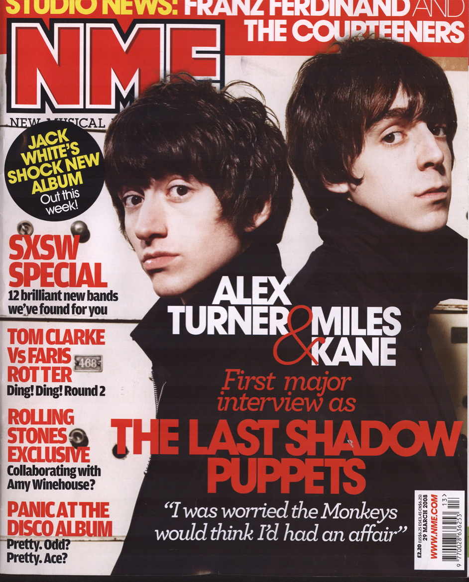
Language: The language that is used in the Magazine is very eye catching with the 3 house colours which are red, white and black. You will be able to see that this follows throughout the entire magazine. There is the masthead which tells you what magazine it is, this is eye catching because it is bold and it is short so it is very memorable. There is a caption ‘THE LAST SHADOW PUPPETS’ which is more eyes catching than the actual name of the magazine. There is also a banner headline at the top of the page which tells the reader what else might be happening in the magazine and what other articles there are in there. This is not as eye catching as the caption or the masthead but it still draws the reader’s attention. ‘ALEX TURNER & MILES KANE’ is very eye catching it tells the reader who they will be expecting to see featured in the magazine, this could widen the audience because if someone liked to listen to and were interested in either Miles Kane or Alex Turner this would make them want to read the magazine. The layout of the magazine is done very professionally because as Alex Turner and Miles Kane are slightly to the right and their names are in the correct place, they are in line. This makes room for the strapline on the left side of the magazine which also tells the reader about what will be in the magazine. The 4 headings in the middle of the page are in different typefaces this grabs your attention and these are all fit in well with the layout of the page.
Audience: The audience of this music magazine would have a range of music taste; the music that the magazine is based around would be Jimi Hendrix, Sex Pistols, The Cure, The Stone Roses, Nirvana, Blur, Oasis and the Arctic Monkeys and so on. So there is a wide range of people, who could like all of this music. The Socio-economic groups for this magazine are C2 = Lower skilled manual, because most of the readers are students or are aged 16-19. The social groups that the magazine would fit in well with would be the students as I just said before. I personally don’t think that there is a certain stereotype that the magazine fits in with because the magazine contains different types of music. The representation of the magazine would be very positive because there is not any bad language on the front cover compared to the Kerrang (the other music magazine that I analysed.) The morals and values that the magazine is trying to put across is that Alex Turner and Miles Kane are talking about their good friendship so they are trying to put across that it is very important to have good friendship.
Institution: IPC Media are the company who publish NME, they produce a wide variety of magazines but NME is their only music magazine. IPC Media have also published a lot of different magazines for example, Nuts, Look and Country Life. So there is a wide range of different kinds of magazines they the company publish.
Ideology: the message that the magazine is trying to put across is telling the reader that Miles Kane and Alex Turner are good friends because they are doing a magazine shoot together and it is mentioned that they are very good friends. Also it is letting the reader know that Miles Kane and Alex Turner used to be in a band together called ‘The Last Shadow Puppets.’ There are a lot of different artists that are features in the magazine issue and this could give the reader more reason to buy it.
Representation: The magazine is putting across that there Miles Kane and Alex Tuner are good friends and there they used to ne in a band together called ‘the Last Shadow Puppets.’

Language: The language that is used in the double page spread of Miles Kane and Alex Turner is very old fashioned looking. The denotations of the double page spread are a heading of ‘BEST OF BOTH WORLDS’ letting the reader know that the article is about. There is the main image of Miles Kane and Alex Tuner, this is what is dominating the whole of the page, one either side of the article in the middle of the page. In the teasing content underneath the heading in a different colour than the rest of the writing is Alex Turner and Miles Kane and also standing out is the band that they used to be in called The Last Shadow Puppets.
Institution: IPC Media are the company who publish NME, they produce a wide variety of magazines but NME is their only music magazine. IPC Media have also published a lot of different magazines for example, Nuts, Look and Country Life. So there is a wide range of different kinds of magazines they the company publish.
Ideology: the ideology of this double page spread is trying to let us know the life of Alex Turner and Miles Kane. This article is about The Last Shadow Puppets wanting to go all over the world and tell everyone about their band. Also giving the reader updates on what was happing and what they both had to go through in the article.
Audience: The audience of this issue of NME are going to want to read it if they are fans of Alex tuner and Miles Kane and what is going on in their life and how they get to where they are in the music world.

Audience: the audience for this magazine would be the people who like to listen and support the bands that are featured in this magazine. Or it could be for the people who genuinely like reading the articles that are in the magazine.
Language: the language that is used is that it is very persuasive as there is a section in the bottom of the page that is trying to make the reader sign up to the magazine and that they can save money. There is also teasing contents around the edge of the magazine because there are small headlines that tell you what is going on, then underneath that there is a couple of sentences that tell the reader more on what they will find in that section. There is also some information about Kasabian. So when the reader is flicking through the magazine they will be able to see that they are featured in the magazine.
Institution: IPC Media are the company who publish NME, they produce a wide variety of magazines but NME is their only music magazine. IPC Media have also published a lot of different magazines for example, Nuts, Look and Country Life. So there is a wide range of different kinds of magazines they the company publish.
Ideology: I think that the contents page is trying to connote a message that they want the reader to know exactly what is going on in the magazine. The page is filled with a lot of information there is no space on the page where it is not filled with information. The main image that is used shows us what the band would be like if you went to see them, it also makes the readers who are not aware of the band; they will know that they look like.
Representation: This page is representing Kasabian and what they will be like if you saw them perform. It is also representing what the reader will be able to get when they sign up for the magazine, the reader can see this because there is a box at the bottom of the page letting the reader aware.
Drafts of Double Page Spread


Kerrang Liiar Analysis

The latest issue of Kerrang features and array of different heavy metal bands as well as individual artists within the feature set. The layout is similar to the other Kerrang issues. The main feature with the character with open arms enticing the reader in, throughout the page at first glance the layout seems to be quiet abstract but the methodology of the layout has been used to draw the reader’s eye from one feature to the next. At the top of the page a strap line exists that uses teasing synergy to draw the reader and entice them to buy it. Large blocks of colour are statically placed and within these blocks fonts have been used to represent the feeling of that particular article. Some of the fonts have obviously been costumed made and represents animal scratching on wood. This animalistic approach is typical for the audience who would purchase this magazine. Without doubt there are more font and attention getters than there are images. But the background which complements the text has a ice texture. This could represent psychologically that this magazine is cool. The language used is predominantly short burst of information for example ‘FEAR! FURY! HEAVY F**KING METAL’ this has been done using white on black which presents the text with gusto. The main heading Kerrang is all in capitals and it appears that it have been warn out of heavily used again this is a well-known magazine that has had a long shelf line which could represent its longevity. Without doubt it would be easy to stereotype the reader of this magazine, arms covered in tattoos long hair gungy looking, dressed in black and so on. Surprisingly the audience is usually someone who has an interest in any type of music. Both young and old tend to buy it. But I guess the main readership would be those in their old teens and early twenties. It is typically a mainstream magazine for those that like this type of music and is no way a specialist magazine focusing on a specific genre of music. Kerrang without any doubt has a cult following and it uses iconography to its best extent. The use of images draws the reader in as well as the text and the layout it adds to the drama of when you buy it. Symbolically Kerrang has a flavour of the occult and some of the typical images represent a gothic point of view. Ultimately the ideology of the magazine is targeted towards male and female it uses good quality paper with a glossy texture it presents a tribute to all of those interested in heavy metal. Even the editor represents the stereotypical ideology of the magazine. Interestingly the lack of adverts is evident and it deals with the serious issues of music and those that follow it. I think the main reason why people buy this magazine is to stay in touch with what is current and what is up and coming.
Liiar Analysis
The way in which I want my music magazine to look like is with a bold masthead which is very eye catching and short so it is very memorable. I would want the colour of my font to be red because if you look on all of the other music magazine mastheads they are mostly red for example: Q, NME and Rolling Stones. I want the three house colours to be red, white and black. These colours would follow all of the way though my magazine. The camera use is very important in my magazine, because I want my pictures to be eye catching to the reader. When I take a picture I would want the model to me looking straight into the camera to make it look as if they are looking at the reader. I would also want small pictures around the edge of the page to make the reader have a little idea on what else is in the magazine. I do not feel that it is necessary to put a splash on the page because I think that the magazine that do that are cheap and need to give away free products to attract their audience. I do not want to do that because I feel that my magazine will automatically grab the audience’s attention without giving away free CDs or lowering the price of the magazine. Also along the bottom of the page I want little heading on whom else would be in the magazine. I think that there is a gap in the market for my magazine because my magazine would consist of R&B, Indie, House Music, and Rock. That way it would widen the range of my audience. I would want my magazine to be next to Q magazine because that is the magazine that I feel it is related to. My target audience would be people who do not have a certain type of music. Also 17- 29 year olds would be an appropriate age for the target of my magazine. I would make my magazine well known by having an event which is on the release date, which will have one of the bands that is featured in my magazine to make my magazine well known. Also at the bands gigs I would have posters around the event letting people know that there is a new music magazine coming out. I did not target my audience any differently because I feel that it suits the audience I have chosen. I did not rise the targeted audience age anymore because I feel that the music would not fit into their genre of music. Older and more mature adults would not practically go for this kind of music they go for more relaxing music and not as heavy as the music I do want to feature in my magazine.
Thursday, 10 November 2011
Main Task Music Magazine
Main task: the front page, contents and double page spread of a new music magazine (if done as a group task, each member of the group to produce an individual edition of the magazine, following the same house style).
Friday, 4 November 2011
Liiar analysis of College Magazine

Our task was to create a college magazine, you could either use an existing college or then make a magazine for that college, you could make on up. The front cover had to be a medium close up of someone’s face to follow the conventions of an actual college magazine.
I feel that my college magazine front cover and content page was effective. I followed the house colours which I feel added to the professional look. Another reason why I followed the two house colours was because the colours of Wyke are green and purple. I followed my magazine conventions correctly, I used a masthead at the top of my front cover to let the reader aware of what college is was doing a magazine for, I also gave teasing content around the edge of the page and I laid them out appropriately, I used a main image of a student who went to the college, which was a medium close up to follow the guide lines, and I used sub-text. At the top of the page I stated what term issue it was to make it look more professional. I also placed a barcode at the bottom of the page and the price at the top of the page to put across that the reader had to pay for it because if there was a couple hundred been published then there had to be a way of making a profit. I made the front cover affective to try and put my own stamp on the magazine, affectively using the colour scheme and working them well together. I tried to make it stand out from all of the other college magazine that people hand done by affectively placing the student in the background picture of Wyke and placing all of the information around her in the appropriate and professional places. With the sun shining in the background I tried to show that it was a nice and relaxing place to be in, but at the same time it was a place for work and a chance for you to do well in further education. I did this by making sure that you could see the buildings in the background. Also the effect that I wanted is that with the sun shining that it was such an outstanding college and that it should be appreciated. I aimed my magazine at both sides of college life, with the fact that there is the building in the background and then with the information around the edge of the page talking about the Pozition parties. I did this because I feel that students would like to know more about the college and what courses it does, then also about the social life of college and what the life is like. I asked a couple of students on what they thought about my front magazine cover, and they said ‘Yeah, it is affective and a good quality front covers. It gives you a little inside on what the college life could be like.’ This is the exact the effect I wanted my magazine to have on people.

My college magazine contents page is full of information about the college and about the courses that I wanted to put across. I followed the house colours that I used on the front cover so it carried out that professional look. I wanted to go for the less is more idea. I didn’t feel that it was necessary to fill the contents page with lots of unneeded photos and useless information. I felt that the pages I put down on the page were very useful for the readers to go and look for because it talks about the student life and about the Pozition parties that are held regally, and then on the other hand I also noted about the different types of courses that you are able to do at Wyke. Then I also mentioned about how the students could get to Wyke, whether they needed to get a train, a bus, or if they were close enough to walk. Underneath the statement that said what you will find on the page, I felt that it would be appropriate to put a caption under it letting the reader know what they could find there, and whether they felt if it was necessary to go to that page. I made the page numbers noticeable for the readers to see, I didn’t want the reader to be struggling when they are trying to see what the page number was. If I made the caption purple then it would be difficult for the reader to see what page number, because it was a dark purple on the students dark jacket, it would not look professional about would not of worked affectively. Along the bottom of the page I placed a selection of pictures that I felt related to the college. There is a picture in the bottom left corner of the page, the reason why I put it there is because it is related to the college because if it is letting the reader know that they have all of the freedom, but it tis their choice if they do well at college, and it is also stating that they are an adult know because they have that ‘freedom.’ There is another picture in the bottom right hand corner of the page. I put it there because it wanted the reader to know that the college was a place where disabled people could go and learn as well because I know that it is difficult for disabled people to go in further education because of the facilities that they need. Fortunately Wyke is installed with lifts to be able to get upstairs and go to all of the lessons. There are no steps for the disabled people to have to struggle with when they go into the buildings around the college. When I asked my fellow students at Wyke what they thought about my college magazine contents page they said ‘it’s good, it is not too busy but yet it is not to boring, it’s good the way that you have placed the boy reading the book behind the writing, it looks affective and professional.’ This is the exact outcome I wanted from my magazine.
The way in which I created my magazine was using Photoshop on my computer, I feel that it is the best way and useful way to make a college magazine; it helps you get that professional look I wanted. It was the first time I had used Photoshop, i felt that it was not that hard to pick up and understand how to use it. Once I had done a couple of drafts on other images and got used to it, I quickly understood how to use it. The reason why I didn’t use my other drafts was because I felt that they were not up to a professional standard. One of my drafts was very boring and it would not catch a student’s eye if it was on the shelf in a supermarket.
I feel that I have done well producing my college magazine, but if I could do it again, I may have tried to make it a little more unique and not so simple and go for more on the content page to try and fill it up.
Thursday, 3 November 2011
Tuesday, 1 November 2011
Subscribe to:
Posts (Atom)